|
Informacije
&
Prodaja |
| Sesta godina obnavljanja prezentacija na BwC-u je garancija kvaliteta i uspesnosti. Uspesnost i popularnost se najbolje ocenjuje kroz javnu statistiku. |
|
Reklamirajte se sa nama Sta je to Internet Marketing BwC Besplatni mali oglasi 
|
|
Resursi |
| Ostali korisni linkovi |
| Provera Top-Level Domena |
 Yulinks Imate website na Srpskom? Prijavite ga! |
ENGLISH This is a small business registry for companies in Belgrade, Serbia. If you want to do business in Serbia don`t hesitate to contact us. We can supply you with all information needed and find you a domestic partner. Send us an E-mail titled |
|
BwC 1999 - 2006 BwC® je registrovan robni znak i logotip Internet Registra Preduzetnistva vlasnistva Lasernet d.o.o. - Beograd |
THE BEST OF CLICKONLINE - 3
 Unsurprisingly, there is a wealth of information about the subject of computers
nestling right inside your computer itself, and here's my run down of the pick
of the crop. I came across Computer
History after I'd been searching around for about an hour, and what struck
me about it was how much more interesting it looks than the dozens and dozens of
mainly text-based sites you'll find if you use the search the words COMPUTERS
HISTORY and MUSEUM. The navigation bar across the top makes exploring the pages
as easy as pushing beads across an abacus - although it does disappear on some
of the exhibits pages, presumably to make way for the exhibits, but I would have
preferred not to have had to click the back button in order to carry on
browsing. Fussy aren't I? Hover your mouse over the main headings to reveal a
directory tree for each section. If you're planning a trip to Silicon Valley
then you can visit this museum yourself, but the online exhibits section should
give you more than enough historic information until you can get there. Two
exhibition sections of particular note - the Curator's Choice, detailing some of
the most important progressions in the science of computing; and This Day in
History, which offers up a quick fact from either this day, or this week in the
past.
 |
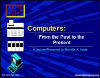
 The next site I've chosen in this category is an online
lecture, something we're seeing more and more of these days. These lectures
are usually designed as study-guides for students, but can make really
interesting surfing for anyone. This lecture charts the entire history of
Computing Science from the days when cavemen developed a primitive form of
counting to mark the cycle of religious festivals and rituals using the moon,
right up to modern-day computers, web technology and networking. The content
isn't particularly deep - if you're an intermediate computer user, you may
already know a lot of what's on these pages. But it's presented really well,
with pictures and diagrams, and a really simple slide-show navigation style that
allows you to concentrate on the information rather than wondering which button
you're supposed to click next. The control icons are at the side of the page and
at the bottom - very useful - and where you see the little exclamation mark icon
the author has inserted links to further information on external websites, so
you can continue browsing to your heart's content. There's even the occasional
detour leading you off in another direction completely for a page or two, which
I thought was a nice touch. According to the author there are still pages and
sections to be added - I guess that's the problem with history, it's always in
need of updating. Definitely worth a visit if you're looking for a palatable
introduction to what is quite a hefty subject though.
 |
 From information that's bang up to date, to stuff that is obsolete now. If you
can't get out to a real computer museum, then check out the Obsolete
Computer Museum, the online resting ground for dignified old relics like my
old ZX Spectrum. Those were the days! Let's face it, for those of us that got
into this whole personal technology craze when it was still just a stumbling
toddler, there's a lot of nostalgia surrounding classic 80's kit like this… or
is it just me? Well, if you are a nostalgia fiend, on these pages you're bound
to find that old computer you first cut your teeth on. Visitors to the site are
encouraged to post comments and memories beneath each exhibit, which adds a
really personal touch. There's normally several pictures and a little
information from the owner of the original kit. Unfortunately, not many of the
owners thought to include the date that the kit was bought in their information,
which left me feeling a little disappointed - but reading down the posted
comments quite often reveals the date in someone's musings about how or when
they acquired their own. I liked the general graphic style too - in keeping with
the subject matter, with the old circuit-board design down the left-hand side -
and everything loaded really quickly, even the Java 3-D models, which are well
worth a look by the way because it's always more rewarding when you can
interact.
 |
 Well, after all that study, you're probably about ready to sit an exam now,
right? OK, maybe not - but if you do fancy a chance to test out all your newly
acquired knowledge then this online study-guide called Computers
in History offers up a selection of questions that should get the old grey
matter ticking over. A mixture of multiple choice and text based responses are
needed. When you've finished you can click to check your answers and receive a
grade. The grade is at the top of the page by the way, not very clear, under
your name. Embarrassingly, I only got 72% when I took the test first time. Got
100% all the way thereafter though… I'll let you into a secret: the questions
never change!
 |
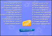
 Our next website is a free Youth
Portal aimed at active young Europeans. Supported by the European
Commission, this site is aimed at young people between the ages of 15 and 25,
enabling them to find information relevant to them about 'their' Europe, but
also to voice their opinions, tell their stories, and feel involved actively as
a part of Europe. Start off by clicking your chosen language. There's plenty of
information about travelling, working and studying in Europe, in the blue Be
Informed section on the left hand side - including many free download areas
where you can get leaflets and brochures detailing different services and
benefits that might be available to you. The green Get Involved section on the
right-hand side, contains options to get chatting and sharing your experiences
and stories with other European Youths. You'll obviously need to register before
you can post, but that is standard practise these days. Reading the posts is
generally permitted with no registration though, so you can still hear what
other people are saying on the various youth issues of the day.
 It's not just children who like to play games, so our final site today is
another one of those directories of Flash animation games that will have you
hooked for hours. Whilst we're used to seeing gorgeous flash games, it's not so
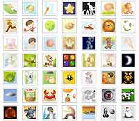
usual to see such a classy menu system. Almost looking like a game itself, Orisinal
lays out your options in a grid of picture icons that animate nicely when you
roll your mouse cursor over them. You might notice that the grey text heading at
the bottom of the grid changes as you move your mouse too, telling you the name
of the game. It's very subtle, and I missed it at first - but I think this just
adds style to the overall presentation. And the games are brilliant. Many that I
haven't seen before. One of my favourites is Baun, the icon with the 4 coloured
lights in the centre of the grid. It's a kind of cross between pinball and
Tetris, where you have to destroy falling blocks of coloured bulbs by stretching
a ball back and releasing it enough pressure to reach the blocks you want to
destroy next. It's not just children who like to play games, so our final site today is
another one of those directories of Flash animation games that will have you
hooked for hours. Whilst we're used to seeing gorgeous flash games, it's not so
usual to see such a classy menu system. Almost looking like a game itself, Orisinal
lays out your options in a grid of picture icons that animate nicely when you
roll your mouse cursor over them. You might notice that the grey text heading at
the bottom of the grid changes as you move your mouse too, telling you the name
of the game. It's very subtle, and I missed it at first - but I think this just
adds style to the overall presentation. And the games are brilliant. Many that I
haven't seen before. One of my favourites is Baun, the icon with the 4 coloured
lights in the centre of the grid. It's a kind of cross between pinball and
Tetris, where you have to destroy falling blocks of coloured bulbs by stretching
a ball back and releasing it enough pressure to reach the blocks you want to
destroy next. |
